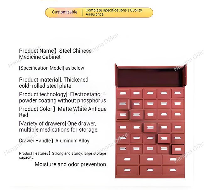
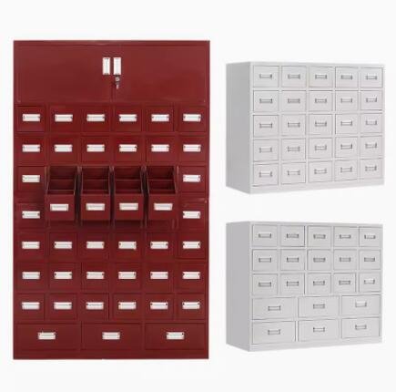
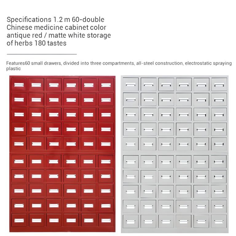
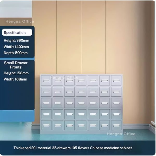
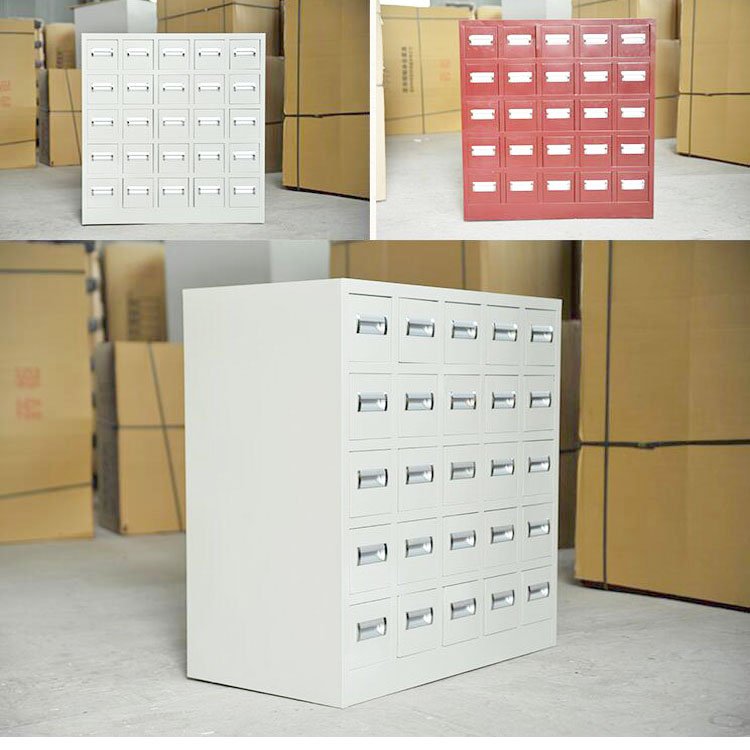
It is the last decision before the order goes in, and the one buyers lose the most sleep over: wine red or light grey? Both are the same steel underneath, the same drawers, the same lifespan — yet the two finishes make a room feel like entirely different businesses. The right answer depends on the room, the patients, and the brand the clinic is building — not on which color photographs better.
This guide compares the two finishes side by side, shows which rooms each one flatters, and answers the question buyers actually ask: which looks more professional?
The Two Finishes at a Glance
| Factor | Wine Red | Light Grey |
|---|---|---|
| First impression | Traditional, warm, established | Clean, modern, precise |
| Best room mood | Warm lighting, wood accents, classic decor | Bright light, minimal interiors, clinical style |
| Patient read | “A pharmacy with history” | “A pharmacy with standards” |
| Shows dust and wear | Very forgiving | Shows marks more readily |
| Pairs with | Brass, timber, calligraphy, herbal displays | White walls, glass, stainless, greenery |
| Under the finish | Identical powder-coated steel | Identical powder-coated steel |
Choose Wine Red When…
- The practice leans traditional. Acupuncture rooms, classical TCM dispensaries, and clinics where the decor already uses timber and warm tones — wine red joins the story instead of interrupting it.
- The shop sells atmosphere. Retail apothecaries and tea rooms: red drawer walls photograph beautifully and signal “established” to walk-in customers.
- The space is dim or warm-lit. Deep red absorbs and enriches warm light; light grey can look stark under the same conditions.
- High traffic, low fuss. Red finishes hide daily scuffs and fingerprints far better than light tones — a real consideration at a busy counter.
Choose Light Grey When…
- The clinic positions as modern and medical. Integrative practices, physio-plus-TCM rooms, and anything with white walls and glass — grey reinforces the clinical-clean message.
- Natural light is strong. Bright rooms make grey cabinets look crisp; they make red look heavy.
- The brand palette is cool. Clinics with blue or green branding will fight a red cabinet every day. Grey cooperates.
- Photos matter to the business. Websites and booking platforms render light grey consistently — it reads “clean” in every thumbnail.

Which Looks More Professional?
The question patients answer without being asked — and the honest answer is that both read as professional in the right room:
- In a warm, traditionally decorated clinic, wine red reads as a practice with lineage — the finish says the medicine here follows tradition.
- In a bright, minimal space, light grey reads as a practice with process — the finish says hygiene and precision.
- Mismatched is the only unprofessional option: red cabinets in a sterile white room look like stage props; grey cabinets in a timber-and-brass interior feel like a lab cart in a tea house.
So the professional choice is the consistent one. Match the finish to the room the patient actually sits in, and either color lands.
Same Steel Under Either Color
Color is the only thing the decision changes. Both finishes are electrostatic powder coatings baked onto the same cold-rolled steel body:
- Same drawer slides, same load ratings, same 15–20 year service life
- Same disinfectant-safe cleaning routine
- Same label slots, locks, and layout options
That is worth saying plainly because buyers sometimes treat the color choice as a quality choice. It is not — it is purely a design decision, which means it should be made with the room in hand, not the spec sheet.
Pairing the Cabinet With Counters and Furniture
The cabinet is one piece of a room. The finish decision gets easier when you plan the neighbors:
- With a dispensing counter. Match or deliberately contrast — a grey counter under a red drawer wall splits the difference cleanly, while a full-red setup reads maximal and traditional.
- With wood furniture. Wine red steel sits naturally beside timber counters and frames; light grey fights warm wood unless the wood is pale.
- With the herb display. Whatever sits in glass jars under light should be fast-turnover stock anyway — the cabinet wall protects the real inventory behind it.
Custom Colors for Brand Matching
When neither standard finish fits — a clinic with a deep green brand, a shop in a heritage building with a mandated palette — powder coating takes custom colors on OEM orders. The practical notes:
- Custom colors run on the same steel bodies with the same finish durability
- Minimum order quantities apply for bespoke colors; standard finishes ship from stock
- Provide a color reference or brand chip with the inquiry and the factory matches from it
A final planning tip: decide the finish with the room’s permanent elements — flooring, frames, fixed lighting — and ignore whatever is temporarily on the walls. Paint changes, posters move, and display shelves come and go. The cabinet is the one piece the room keeps for fifteen-plus years, so it should match the things that are equally permanent.
FAQ
Can I order some rows in red and some in grey?
Yes — split-finish orders are common for clinics that want the working wall in grey and the customer-facing section in wine red, or for zoning by function.
Which finish ages better?
Identically — powder coating does not fade noticeably indoors in either color. The difference is only in which finish hides daily scuffs better, and red wins that round.
Does the red finish look the same as traditional lacquered wood cabinets?
It reads as the same tradition at room distance, with a cleaner, more even surface up close. Many clinics pair one antique wooden piece with wine red steel working stock — the wall stays coherent.
What if I order and regret the color?
Standard finishes ship fast, which is also why it pays to decide with the room in hand. Custom colors are a made-to-order path for a true match after the fact, with production lead time.
Do both colors cost the same?
Standard wine red and light grey carry the same price — the difference is purely the powder used. Only custom colors affect the quote.
Can I see a finish sample before ordering?
Ask the supplier for finish samples or factory photos under neutral light before committing — screen colors vary too much to decide from a listing thumbnail. Some clinics order a small sample panel with a first shipment and confirm the room match before the main order.
Which finish is better for a clinic that also sells online?
Light grey photographs more predictably — it reads clean and neutral on screens without color-casting the herbs beside it. Wine red shots need warmer lighting to flatter; they look great on brand pages but demand a steadier hand.
Which finish works better in a small room?
Light grey recedes and makes compact rooms feel bigger; wine red draws the eye and makes the same room feel richer but fuller. If the cabinet is the room’s feature piece, red delivers drama — if the room already has plenty going on, grey keeps the peace.
Match the Room, Not the Catalog
Wine red and light grey are both professional finishes — in the rooms they belong to. Hold the finish against your walls, your lighting, and your brand palette before ordering, and the choice stops being a debate and becomes obvious. The steel underneath will not let you down either way.
Browse both finishes in our steel medicine cabinet range, or read about antique red and matte white herb cabinet pairings for more room-style ideas.